Project 4 Rework - Jon Lerew
This campaign had a couple of adjustments made to each of the three magazine ad designs. On the green one, I adjusted the size and positioning of elements to remove some of the empty white space. On the blue one, I toned down the color of the figure so that the text didn't blend in as much. The red one was changed too to match this so I didn't look too vibrant next to the other ads.
New images are placed first, then originals for comparison.


New images are placed first, then originals for comparison.
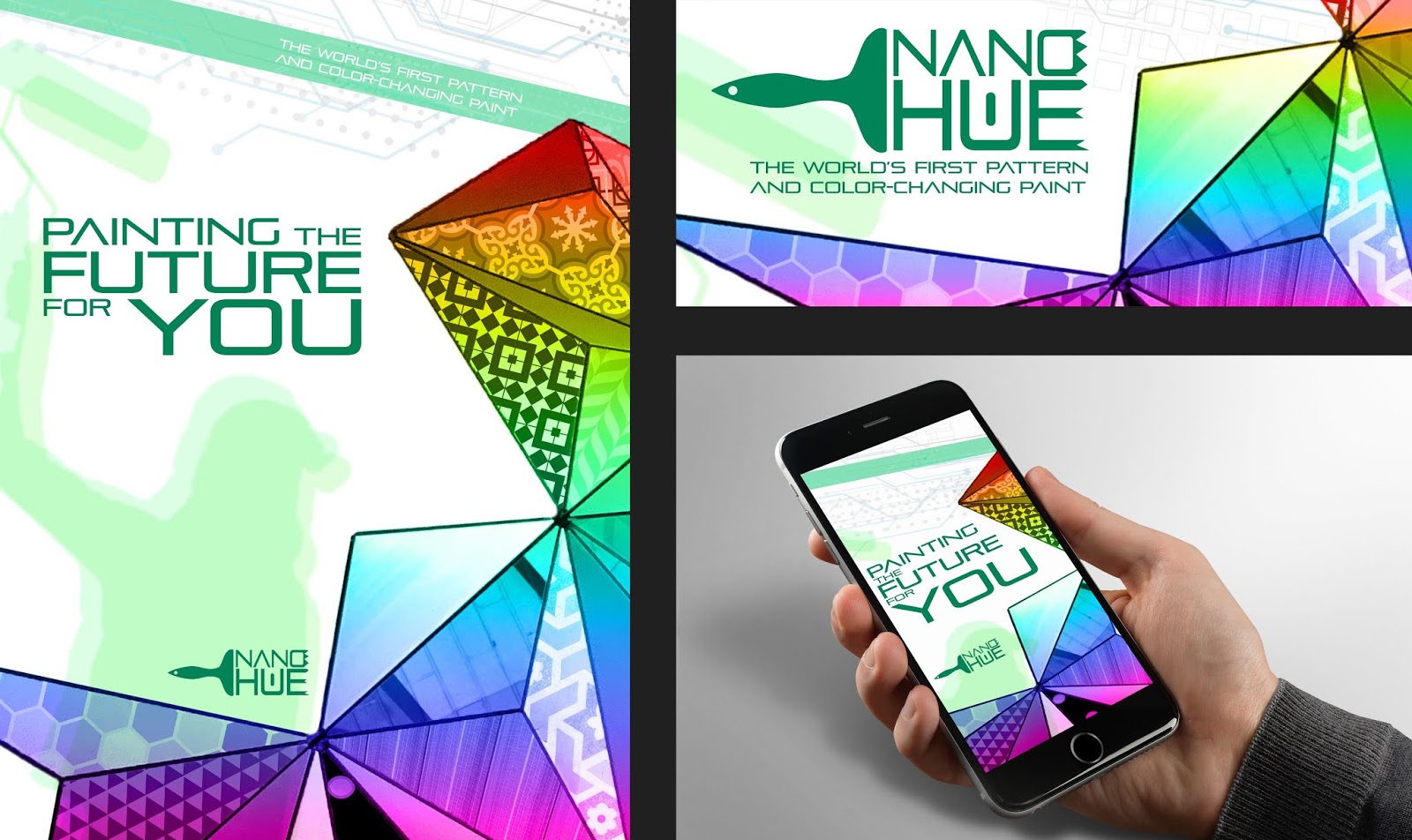


The logo is really well designed, and the colors are great. I can't tell the difference from the original to the new one, but it looks great regardless.
ReplyDeleteYour design looks good J. The colors work well together and the changes are subtle but they work well.
ReplyDeleteLooks done to me!
ReplyDelete