Posts

Showing posts from March 17, 2019

Project 4 - Isabella Marinelli

Image
With the original shirt design were 6 hand drawn stickers, I don't have the time to draw all different illustrations until I am caught up with school so I just made a couple different color variations after making the drawing. Let me know what you think. Thanks!

Résumé and Cover Letter Feedback Needed - Jon Lerew

Image
I took the suggestion of decluttering and created a few versions. Not sure which one is going in the right direction and could use some feedback.

Project 12 Final - Jon Lerew

Image
I fixed the gap between the text and the recycling symbol. Still open to more critiques if anyone has suggestions.

Project 10 Final - Jon Lerew

Image
Made the center line equal as Gina and Coni suggested. I keep going back and forth on this. I can't decide if it's better or not. Obviously the equal line width makes sense, but I wonder, since the design isn't split 100% in half now and some of the white space in the ocean was lost to the center line, does it feel imbalanced now? Let me know your thoughts. New Old

Project 9 Final - Jon Lerew

No additional critiques were given so this is the same as the previous version.

Project 8 Final - Jon Lerew

Image
No additional critiques were given so this is the same as the previous version.

Project 3 - Bella Marinelli

Image
I wasn't sure what or how much I wanted to change so instead I focused on the critiques I recieved in class when I first presented this project. I have a lot of mixed feelings about both of them and spent a lot of time trying different things. Feedback welcome.

Project 4 3/21/19- Daniel Hurst

Image
I brightened up the tan and faded California a bit more.

Gina - Service Learning Project

Image
Service Learning Client -  Update Gina Khouth I created a brand board for my client. The logo was already created from the previous designer (the primary logo), but needed to be vectored. I created variant versions of it and the color palette. The fonts was already picked out. And created icons based around the statue design. These can now be applied and used for any of their prints and online medias. I'll need some feedback and will further consult with my clients about more ideas. They wanted help with branding, and it included social medias. Here's a mockup of their facebook with a new design.  The current state is entirely different. I thought I could bring in appeal for first impression when people first look them up. I am planning to consult more with my client to hopefully produce something more original and see what they think of this branding. I'd love some feedback!

Project 4 rework 3/20/19- Daniel Hurst

Image
I changed the blue color of the Tour stadiums to something closer to what is in the image.

Project 2- Bella Marinelli

Image
I didn't stray too far from the original design so all ideas are welcome. :)

Resume + Business Card and Logo- Bella Marinelli

Image
Critiques and suggestions are welcome! A different color palette than what I usually work with but I had fun and found it refreshing.

Résumé and Cover Letter - Jon Lerew

Image
Let me know what you all think of my résumé and cover letter design. I tried to keep things clean but not boring. Not sure what social media to include, I put Instagram and LinkedIn.

Logo Design - Jon Lerew

Image
So I played around with a lot of different ideas trying to come up with a logo. I eventually settled on this one which was an abstraction of my last name arranged to resemble a pencil. I think it fits in with my style but I'm open to feedback too.

Personal Business Card- Bella Marinelli

Image
At first, I was trying to do something minimalistic and elegant but it really wasn't working for me, I feel like I just can't achieve it. But I wanted to include them anyway, since they were part of the process of getting to the third design. I feel like the third design is the most in line with my style. I wanted to put 'designer and illustrator" instead of 'graphic designer' because my dream job would be illustration and that's what I enjoy the most (when I have time for it). All critiques, ideas and suggestions are welcome.

Personal Logo - Bella Marinelli

Image
This is my personal logo which I hope will appear on my updated resume and business card designs. I know y'all didn't want me to do a bird, but conservation of parrots and rescue of them is an issue close to my heart and when I get freelance work I often donate part of that to those causes. It's my passion and Comet was my soulmate so I think he represents me well. Any design critiques and ideas are welcome, I went back and forth on a lot of ideas so I am open to suggestions. Thank you :)

Project 12 Rework - Jon Lerew

Image
Here I went ahead and added a paragraph of body text with a call-to-action. I changed the word "red" to have the leaf texture and also brightened the stem, leaves, and recycling symbol.

Project 11 Feedback Needed - Jon Lerew

Image
So I haven't been able to work on this project because the typefaces I used are only on the school computers, but in the meantime, if anyone else has more suggestions throw them my way for when school is back in session!

Project 10 Rework - Jon Lerew

Image
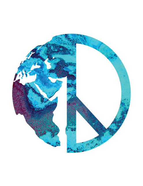
To rework this design it was mostly minor adjustments (fixed some islands and such). I decided to leave the proportions of the peace sign alone because I felt that it started to become unbalanced when I adjusted it. It 's not in the mockup frame right now but I'll wait to re-add it there for when the final version is ready.

Nashoba Valley Corale Drafts-Feedback Needed

Image
My apologies for uploading this so late, but here are my three drafts so for the new Nashoba Valley Chorale Logo. I decided to go with a female conductor silhouette because the Chorale's conductor is also a female. The font I used for the first draft is Baskerville Old Face, The font I used for the second draft is Bookman Old Style. Finally, the font I used for the third draft is Footlight MT Light.  

Project 4 3.0- Daniel Hurst

Image
I changed the color to reflect the baseball stadium. However I feel like the black and white text may be hard to read.

Gina - Menu Project - Updated

Image
Basic Snacks Menu  -  Update Gina Khouth OUTSIDE INSIDE An updated version of a menu I made for Publication class. It's suppose to fold like a trifold but from up to down. For what I've changed, I had removed the extra wording of snacks that used to be on the bottom left of the inside of the menu. I had also added extra elements on the back side of the outside. It was plain brick background before, but took the great suggestion of adding an address. As well as I also added social media icons, matching the design of my collateral piece (to-go bag).

Service learning flyer (Feedback please)

Image
I've been stuck on this. I went a different way design wise and avoided putting the logo in the middle after getting advised. I put "Join us in showing for Racial justice!" in a ghost box (so it will be legible) in the image above, trying to avoid cluttering the image, but it still feels out of place or not enough, I thought of moving it into the circle below as a header, or getting rid of that circle (the one near the bottom) altogether and trying to fit the text and that was in the circle along with "join us in showing up for racial justice, or maybe it's the little shapes i added in that limit me so much. I am also trying to go for a "clean look/spread"