Mount Wachusett Community College, in Gardner MA offers a 2-year program for Graphic and Interactive Designer students. This final course in the GID program helps students assemble and present their best work produced in the program. This blog is produced by the GID Portfolio class under the direction of instructor Coni Porter.
Business Card Designs - Nicole Wetherby
Get link
Facebook
X
Pinterest
Email
Other Apps
-
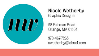
Here are a couple of Business Cards I designed for myself. Any feedback would be great. Just image they have rounded corners.
Love the colors and the simplicity of it. I think the letters could be incorporated into each-other a bit more if you wanted to expand on it. The colors on your business card compliment each-other very well, but it just feels a little empty to me.
My favorite is the bottom pair for front and back. I don't think it's too empty, seems pretty balanced to me. I don't think you would need your address on there, though? Perhaps Instagram or LinkedIn?
Very different styles - the top is a more mobil-device type of contemporary design, the bottom celebrates the organic swashes of the art nouveau era. I think this is up to you in the end. However, if you choose to pursue the bottom design I also suggest that you consider how the 2 elements (N and W) can be combined into a more unique design. Something that shows your typographic skills in the deconstruction and reconstruction of letter forms. I'm loving the colors too!


Love the colors and the simplicity of it. I think the letters could be incorporated into each-other a bit more if you wanted to expand on it. The colors on your business card compliment each-other very well, but it just feels a little empty to me.
ReplyDeleteMy favorite is the bottom pair for front and back. I don't think it's too empty, seems pretty balanced to me. I don't think you would need your address on there, though? Perhaps Instagram or LinkedIn?
ReplyDeleteVery different styles - the top is a more mobil-device type of contemporary design, the bottom celebrates the organic swashes of the art nouveau era. I think this is up to you in the end. However, if you choose to pursue the bottom design I also suggest that you consider how the 2 elements (N and W) can be combined into a more unique design. Something that shows your typographic skills in the deconstruction and reconstruction of letter forms. I'm loving the colors too!
ReplyDeleteI feel like the first one is more colorful and more eye catching.
ReplyDelete