Project 6 rework
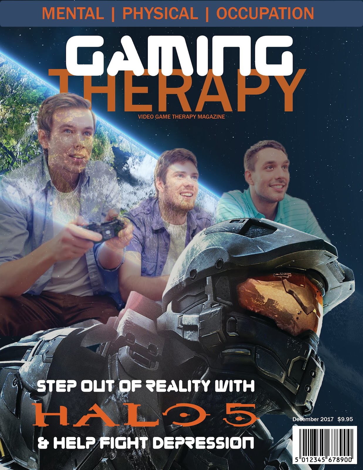


I lightened up the orange on each page, and made the article page better, inspired off of my game informer magazine, where page 2 and 3 share the background image and 2 has a title with author credit while the article is on the 3rd page. And I realize I have two "page 2s" (I'll be making the article pages 28 and 29 to match up with whats said in the contents page). And I added more to the first blurb on the contents page. And yes it was a real article from The anxiety guy.
Your work has improved the pages.
ReplyDeleteTable of Contents: there is inconsistency in the leading of your items... please make sure that you are being consistent with the negative space before and between your text.
Article: What is the size of your body copy on the last page? Remember - body copy, in print projects, should be between 9-12 pt. You may need to reduce that pt size a bit, and find more type to fill out the page.
Big improvements, it looks much more like a real magazine now. I agree with what Coni said, but I also want to mention that there is some inconsistency with the images on the contents page. It seems like the first two are the same width and the second two are a different width, and I think three of them are the same height and one isn't? I believe the design would be stronger if at least the width were consistent each article listing.
ReplyDeleteThe work is showing in how your designs improve.
ReplyDelete